
우노
[Python] Matplotlib 기초 본문
Matplotlib이란?
- Python 라이브러리 중 하나로 그림이나 도형을 그려준다.
- 데이터 입력을 위해 numpy나 scipy와 같이 사용하며, MATLAB 대신 쓸 수도 있다.
선 그래프 (line chart)
하나의 figure 안에 하나의 line 그리기
  from matplotlib import pyplot as plt

  # x,y 축 데이터
  years = [1950, 1960, 1970, 1980, 1990, 2000, 2010]
  gdp = [300.2, 543.3, 1075.9, 2862.5, 5979.6, 10289.7, 14958.3]

  # 표 내부 설정
  plt.plot(years, gdp, color='green', marker='o', linestyle='solid')

  # 표 외부 설정
  plt.title("Nominal GDP")
  plt.ylabel("Billions of $")
  plt.xlabel("Years")

  # 표 그리기
  plt.show()

  # 파일 저장
  plt.savefig("hello.pdf", dpi=300)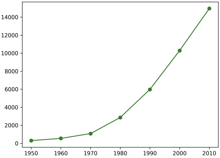
하나의 figure 안에 여러 line 그리기
  variance = [1,2,4,8,16,32,64,128,256]
  bias_squared = [256, 128, 64, 32, 16, 8, 4, 2, 1]
  total_error = [x + y for x, y in zip(variance, bias_squared)]
  xs = range(len(variance))

  # 표 내부 설정
  plt.plot(xs, variance, 'g-', label='variance')
  plt.plot(xs, bias_squared, 'r-.', label='bias^2')
  plt.plot(xs, total_error, 'b:', label='total error')

  # 라벨 위치
  plt.legend(loc="upper center")

  # 표 외부 설정
  plt.xlabel("model complexity")
  plt.xticks([])
  plt.title("The Bias-Variance Tradeoff")

  # 표 그리기
  plt.show()
여러개의 figure 그리기
  import numpy as np
  import matplotlib.pyplot as plt

  # figsize=(9,9)를 사용하여 최초 창의 크기를 가로 세로 9인치로 설정한다.
  fig = plt.figure(figsize=(9,9))

  # 가로 1칸, 세로 2칸으로 쪼개고 그 중 첫 번째 칸에 ax라는 이름의 axes를 생성한다는 뜻이다.
  ax1 = fig.add_subplot(1,2,1)
  # 가로 1칸, 세로 2칸으로 쪼개고 그 중 두 번째 칸에 ax라는 이름의 axes를 생성한다는 뜻이다.
  ax2 = fig.add_subplot(1,2,2)

  # set() 메서드를 이용해 표 외부를 설정
  # x축 및 y축의 최댓값과 최솟값, 그래프의 제목, x축 및 y축의 이름을 설정
  ax1.set(xlim=[1930., 2020.], ylim=[0, 16000], title='Example', xlabel='xAxis', ylabel='yAxis')
  ax2.set(xlim=[1930., 2020.], ylim=[0, 16000], title='Example', xlabel='xAxis', ylabel='yAxis')

  # 아래와 같이 파라미터를 나눠서 설정도 가능하다.
  # ax.set_xlim([0., 1.])
  # ax.set_ylim([-0.5, 2.5])
  # ax.set_title('Example', size=20)
  # ax.set_xlabel('xAxis', size=10)
  # ax.set_ylabel('yAxis', size=15)

  x = [1950, 1960, 1970, 1980, 1990, 2000, 2010]
  y = [300.2, 543.3, 1075.9, 2862.5, 5979.6, 10289.7, 14958.3]

  # plot() 메서드를 이용해 표 내부를 설정
  ax1.plot(x, y, marker='o', color='green', linewidth=3, linestyle ="solid")
  ax2.plot(x, y, marker='o', color='green', linewidth=3, linestyle ="solid")

  # plt.show()는 생성된 모든 figure를 보여준다.
  plt.show()
막대 그래프 (bar chart)
이산적인 항목에 대한 변화나 차이를 보일 때 활용
  movies = ["Annie Hall", "Ben-Hur", "Casablanca", "Gandhi",
   "West Side Story"]

  num_oscars = [5, 11, 3, 8, 10]

  plt.bar(movies, num_oscars)

  plt.title("My Favorite Movies")
  plt.ylabel("# of Academy Awards")

  plt.show()
히스토그램 (Histogram)
정해진 구간에 해당하는 항목의 개수를 보이는 막대그래프 (값의 분포)
  from collections import Counter

  grades = [83, 95, 91, 87, 70, 0, 85, 82, 100, 67, 73, 77, 0]
  histogram = Counter(min(90, grade // 10 * 10) for grade in grades)

  plt.bar([x + 5 for x in histogram.keys()], histogram.values(),
  width=10, edgecolor="black")

  plt.xticks(range(0, 101, 10))
  plt.xlabel("Decile")
  plt.ylabel("# of Students")
  plt.title("Distribution of Exam 1 Grades")

  plt.show()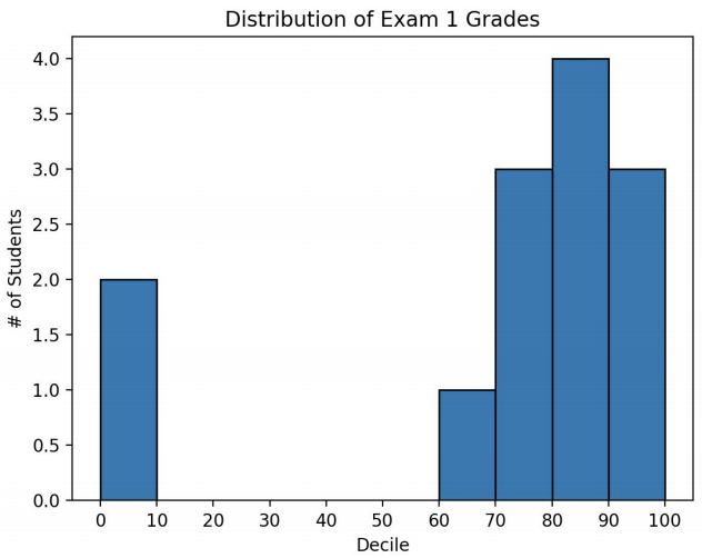
산점도 (scatterplot)
두 변수 간의 연관 관계를 보일 때 활용
  import matplotlib.pyplot as plt

  friends = [ 70, 65, 72, 63, 71, 64, 60, 64, 67]
  minutes = [175, 170, 205, 120, 220, 130, 105, 145, 190]
  labels = ['a', 'b', 'c', 'd', 'e', 'f', 'g', 'h', 'i']

  plt.scatter(friends, minutes, marker='^', color='darkgreen')

  for l, f, m in zip(labels, friends, minutes):
   plt.annotate(l, xy=(f, m),
   xytext=(5,-5), textcoords="offset points")

  plt.title("Daily Minutes vs. Number of Friends")
  plt.xlabel("# of friends")
  plt.ylabel("daily minutes spent on the site")

  plt.show()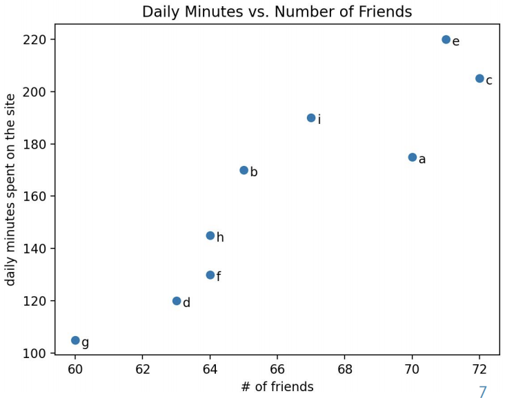
네트워크 시각화 (network visualization)
networkx : 네트워크 분석용 python 패키지
  import networkx as nx

  G = nx.Graph()

  G.add_edge('A','B', color='r', weight=1)
  G.add_edge('C','B', color='g', weight=2)
  G.add_edge('B','D', color='b', weight=5)

  pos = nx.spring_layout(G)

  colors = list(nx.get_edge_attributes(G, 'color').values())
  weights = list(nx.get_edge_attributes(G, 'weight').values())

  nx.draw(G, pos, edge_color=colors, width=weights, with_labels=True)
  plt.show()
'Language > Python' 카테고리의 다른 글
| [Python] 산점도 행렬 (scatter_matrix) (0) | 2020.07.31 |
|---|---|
| [Python] Matplotlib 3차원 산점도 그리기 (4) | 2020.07.29 |
| [Python] Pandas DataFrame 행,열 삭제 (0) | 2020.07.28 |
| [Python] Numpy와 Pandas를 사용한 데이터셋 생성 (0) | 2020.07.25 |
| [Python] Pandas 개념 및 DataFrame 생성 방법 (1) | 2020.07.24 |
'Language/Python' Related Articles
more


Comments